
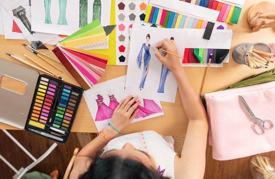
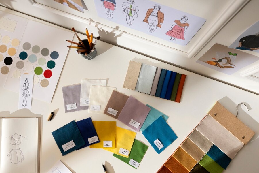
The art of color combination when it comes to dress design, color is one of the most important elements that can make or break a look. Whether you’re designing for a runway show, creating a custom piece for a client, or simply experimenting with different hues for personal style, understanding how to mix and match colors is key to achieving a balanced and visually appealing design.
In this blog post, we’ll explore the principles of color theory, the best practices for combining colors in dress design, and how to create striking looks that capture attention while maintaining harmony.
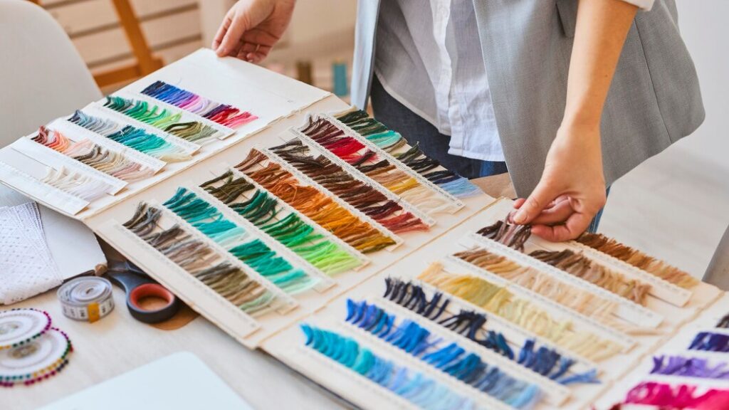
1. Understanding Color Theory in Fashion Design
Color theory is a concept that has been used for centuries to understand how colors interact with each other. It helps designers create combinations that are visually appealing and emotionally resonant. At its core, color theory breaks down colors into three primary categories:
Primary Colors: Red, blue, and yellow serve as the foundation for every other color in the spectrum, the purest hues from which all others are derived.
Secondary Colors: By blending two primary colors, we get vibrant secondary hues—green, orange, and purple—that add depth and contrast.
Tertiary Colors: These are the nuanced shades born from the fusion of a primary and a secondary color, giving rise to rich tones like turquoise, coral, and chartreuse.
By knowing how colors are related to one another, designers can make informed decisions on how to pair colors that either complement or contrast in a way that enhances the overall design.
2. Color Harmonies: Creating Visual Balance
One of the most important concepts in color design is the idea of color harmony. Harmony refers to the balanced use of colors in a design so that they work well together. Here are some common color harmonies used in dress design:
- Monochromatic: This scheme involves using different shades, tones, and tints of a single color. For example, a dress design featuring varying shades of blue—from navy to sky blue—can create a cohesive, elegant look. Monochromatic designs often appear sophisticated and minimalistic.
- Analogous: These are colors that sit next to each other on the color wheel, such as blue, blue-green, and green. This combination feels natural and serene. Analogous schemes work well for creating soft, harmonious designs with a sense of unity.
- Complementary: Complementary colors are those that sit opposite each other on the color wheel, such as red and green, or blue and orange. These combinations create contrast and can make a bold statement. When using complementary colors in dress design, it’s important to balance them carefully to avoid overwhelming the viewer.
- Split-Complementary: This is a variation of the complementary color scheme, where instead of using the direct opposite color, you use the two adjacent colors. For example, if you start with blue, instead of using orange, you would use yellow-orange and red-orange. This offers a more subtle contrast while still maintaining vibrancy.
- Triadic: A triadic color scheme involves using three colors that are evenly spaced around the color wheel, such as red, blue, and yellow. Triadic combinations are vibrant and dynamic, but require careful consideration to avoid clashing or overpowering the design.
3. The Role of Neutrals in Dress Design

While bold, vibrant colors are eye-catching, neutrals play a vital role in any wardrobe or design collection. Neutrals, like black, white, gray, beige, and ivory, provide a grounding effect in a design and can help other colors pop. For instance, a bright yellow dress can be balanced with a black belt and shoes, or a floral print dress can have a neutral background to let the patterns stand out.
In addition to their aesthetic function, neutrals are timeless, versatile, and can help add a touch of sophistication to any outfit. Designers often use neutrals as a backdrop to allow accent colors to shine without overwhelming the overall look.
4. Seasonal Color Trends in Fashion

Color trends in fashion often change with the seasons. Each season brings its own set of popular colors, influenced by cultural events, environmental factors, and even technology. For example:
- Spring: Light pastels like mint green, lavender, blush pink, and baby blue often dominate spring collections. These colors are fresh, light, and youthful, evoking a sense of renewal.
- Summer: Vibrant hues such as coral, turquoise, and lemon yellow are common in summer fashion. These colors reflect the energy and warmth of the season.
- Autumn: Fall collections tend to gravitate toward deeper, richer tones like burgundy, mustard yellow, forest green, and burnt orange. These colors are warm and earthy, reflecting the changing colors of leaves.
- Winter: Winter fashion often embraces jewel tones like emerald green, sapphire blue, and ruby red, as well as deep neutrals like charcoal gray and midnight black. These colors are bold, luxurious, and sophisticated.
Designers take these seasonal cues into account, but it’s also important to keep in mind that personal style and cultural influences will always play a role in color selection.
5. Psychology of Color in Fashion
Colors have a powerful psychological impact on the wearer and the viewer. When designing dresses, it’s important to consider not just how colors look, but also how they make people feel. Here are some emotional associations with common colors:
- Red: Passion, power, and excitement. A red dress commands attention and is often seen as bold and daring.
- Blue: Calm, trust, and professionalism. Light blue can evoke a sense of peace, while navy blue is often associated with elegance.
- Yellow: Happiness, energy, and optimism. A yellow dress can feel fresh and lively, though it’s important to balance it with complementary colors to avoid overwhelming the wearer.
- Green: Harmony, nature, and growth. Green dresses can evoke feelings of balance and tranquility.
- Purple: Luxury, creativity, and mystery. Purple is often used in eveningwear and high-fashion designs for its regal and sophisticated vibe.
- Black: Elegance, power, and timelessness. A black dress is a staple in any wardrobe, representing sophistication and versatility.
- White: Purity, simplicity, and freshness. White dresses often represent a blank canvas or innocence, making them a popular choice for weddings or minimalist designs.
6. Experimenting with Color in Fashion Design
While knowing the rules of color harmony is essential, the world of fashion also thrives on creativity and experimentation. Don’t be afraid to break the mold and try unconventional color combinations. Some of the most memorable fashion moments have come from daring designers who played with bold pairings—think of a hot pink dress paired with neon green accessories or a mustard yellow and lavender combination that feels both retro and fresh.
However, even when experimenting, remember to consider the balance of the design. Pay attention to how the colors interact with the fabric, the silhouette, and the overall theme of the collection.
7. Art of Color Combination
Color is not just a design tool; it’s a language of its own. It can tell a story, evoke emotions, and set the tone for an entire look. As a dress designer, understanding the principles of color theory, experimenting with different color harmonies, and considering the psychological impact of each hue will allow you to create stunning, impactful designs that resonate with the wearer and the audience.
The key to mastering color combination in dress design is practice, observation, and a willingness to take creative risks. So go ahead, explore the rainbow of possibilities, and let your designs speak through color!
Feel free to let me know if you’d like me to dive deeper into any specific aspect of color theory or dress design!